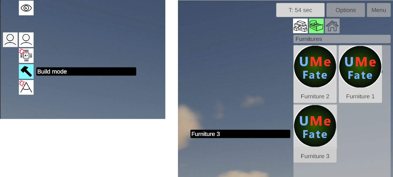
This time more focusing on polishing ingame UI framework, which holds many placeholders, some are for later to be changed. But now things should be more friendly to players, in comparison to the previous UI. I have added tooltips system, which will allow to see more descriptive info about selected UI option.
Ensuring correct functionality and to be able to expand it later, this requires multiple of changes, and various boring and tedious tasks.
Besides placing layout and making icons, there is code involved. Testing and cleaning is major part of it.
I need to say, I like concept of the flat icons design. It makes things clean and less clutter.
Now moving this UI prototype into main game, replacing older UI. Which will require more work on that level.
I think it is not too bad in general. But time will tell 🙂

